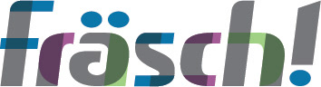
Fräsch - New Logo & Rebrand


Fräsch is a furniture manufacturer focused on the intersection of design, value and wellness. Additionally, the company has a separate product line, called Stille, that needed to fit into the new branding that would be created.
Stille provides sound dampening solutions including mobile walls, art, furniture and even fixtures out of their unique material.
My challenge was to rebrand the company and blend the clean stylings of Scandinavian design and the American pop culture while showing an appreciation for nature. I created a logo that's bold, fresh, and edgy with a tech feel.
Logo
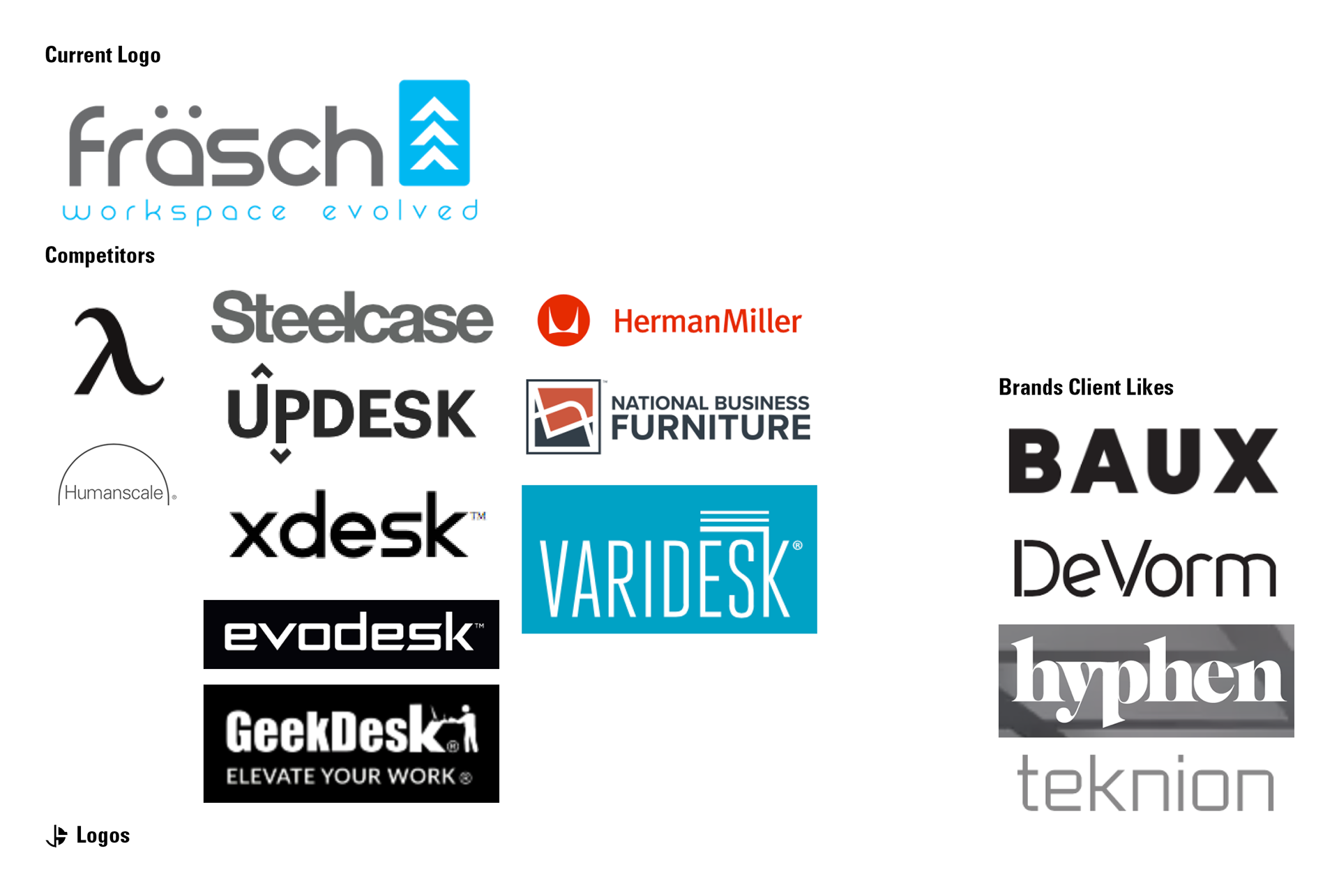
For the logo design I started by doing a visual comparison of the current logo, the brands the client admired, and their competition. This helped to esblish a based line for some key criteria.
1. Where are we starting and how do we compare?
2. How can Fräsch stand out in the current competitive landscape?
3. Which visual aesthetics are common and how can we use those to our advantage?
Below is that comparison.
Then, I looked at the desired values and visual inspiration from the client. I looked through the following criteria and devised a plan of attack to help accomplish the goals outlined.
Definitions:
Fräsch comes from the Scandinavian word for "fresh" or "crisp".
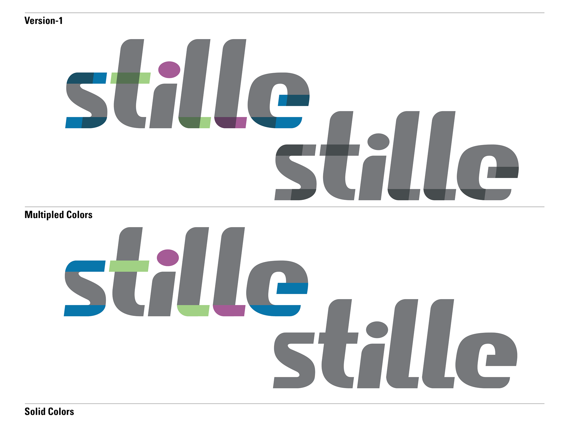
Stille comes from the Scandinavian word for "silent". These are traits that had to carry over into the logo.
Values:
Design - Wellness - Ergonomics - Purposeful Design - Freedom - Fun - Engaging - Community Work Values
Visual Inspiration:
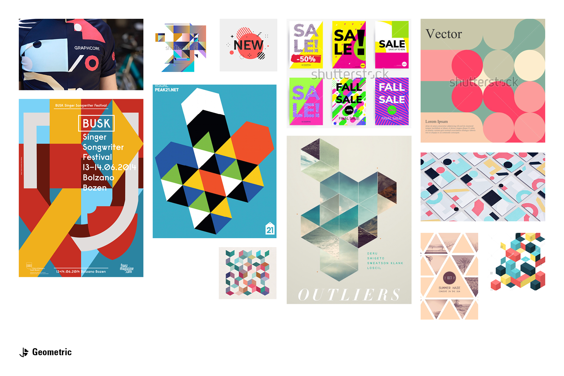
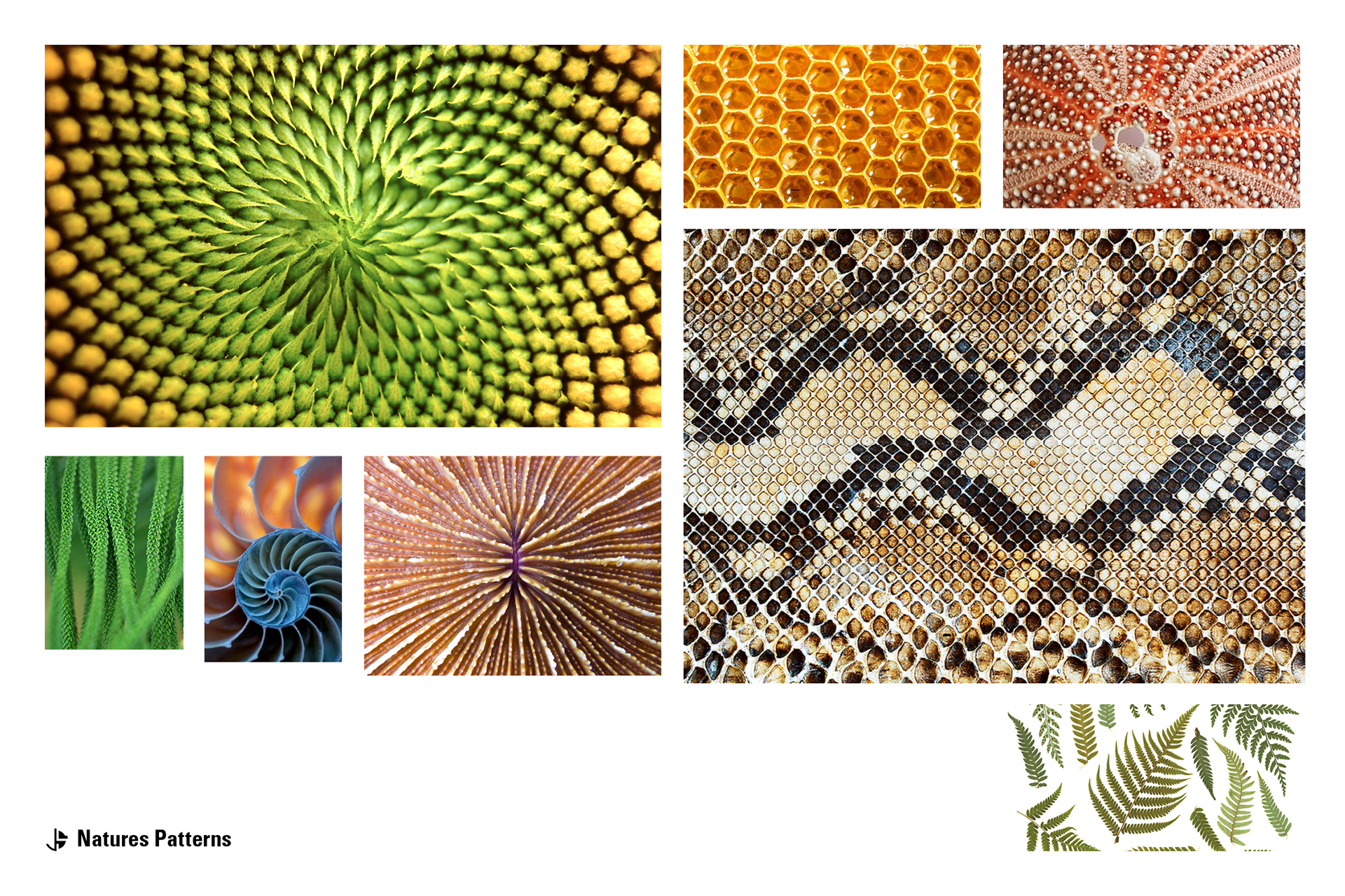
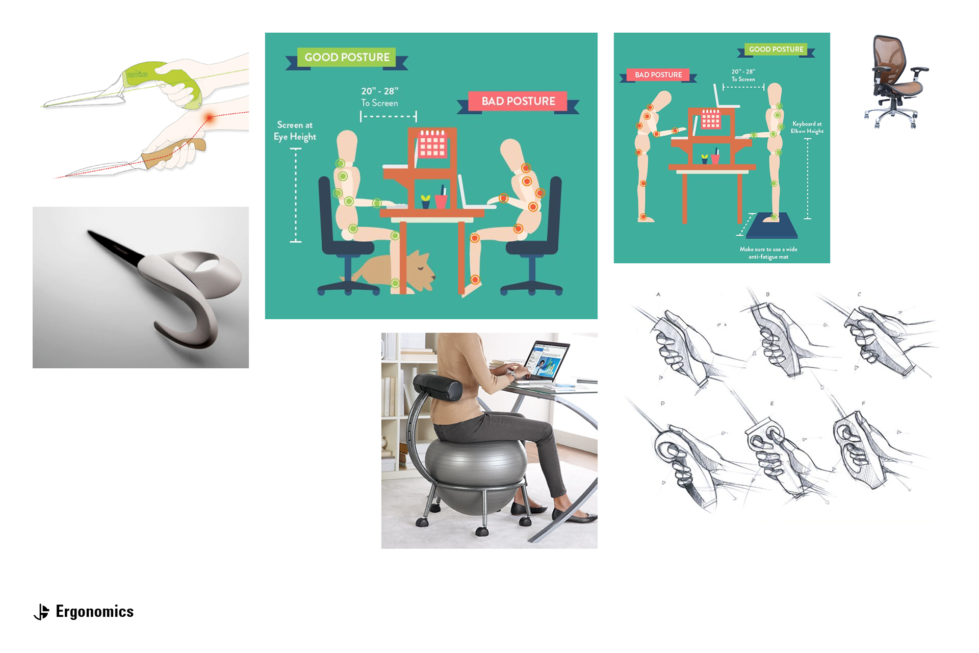
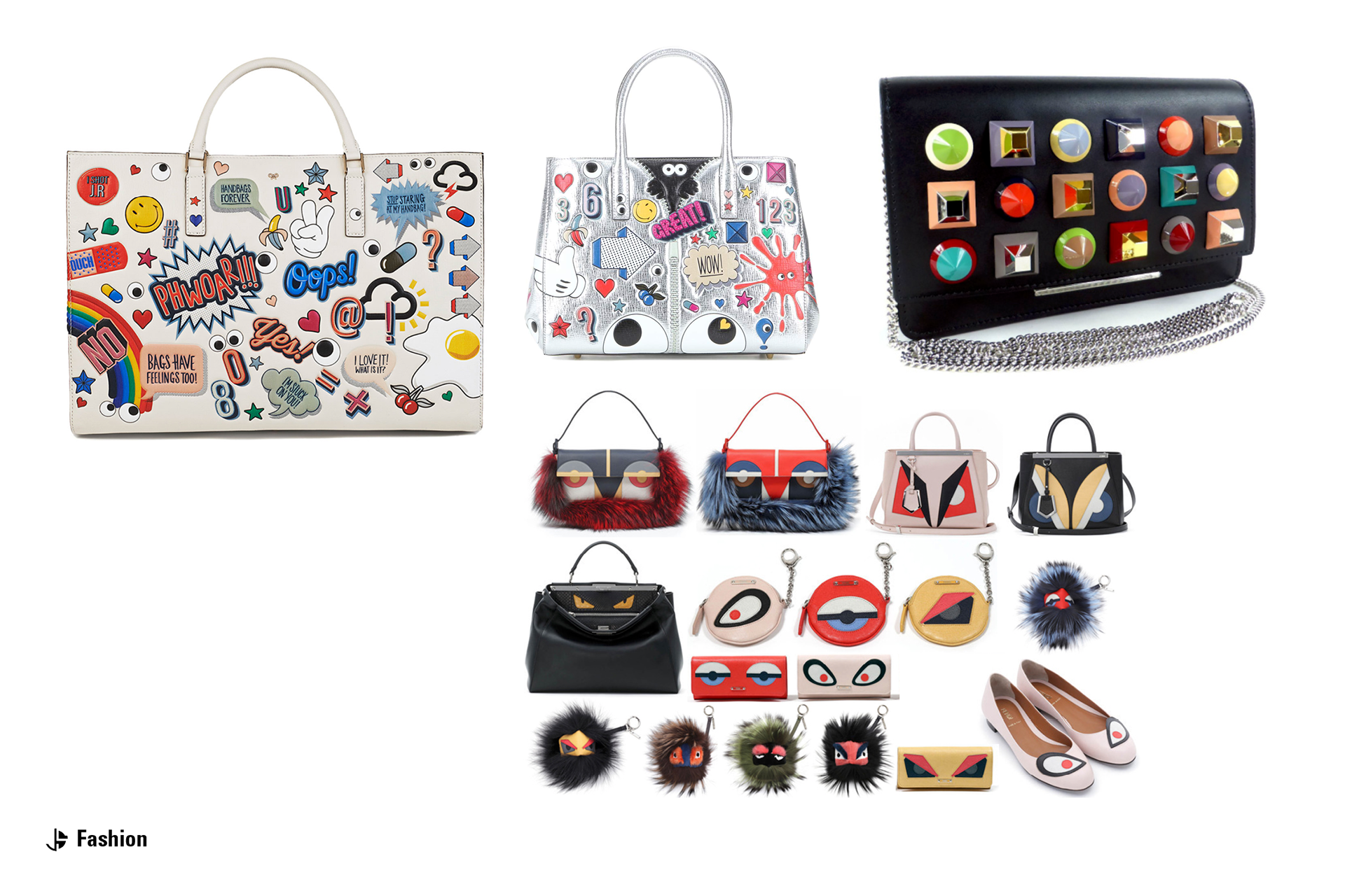
Swedish meets American Design - Nature: Raw Elements, Plants - Health & Wellness - Connection To Past Through Design Of Spaces - Millennial To Small Business -Demographics - Diversity - Workstyle - Urban Oriented - “Smile” Face Icon: Playful, Fun - Modern: Clean, Swiss, “Ikea Meets Teknion” (Baux. com, Devorm.nl, Hyphen.us, teknion.com) - Functionality - Artistic/Fashion - Texture/Pattern
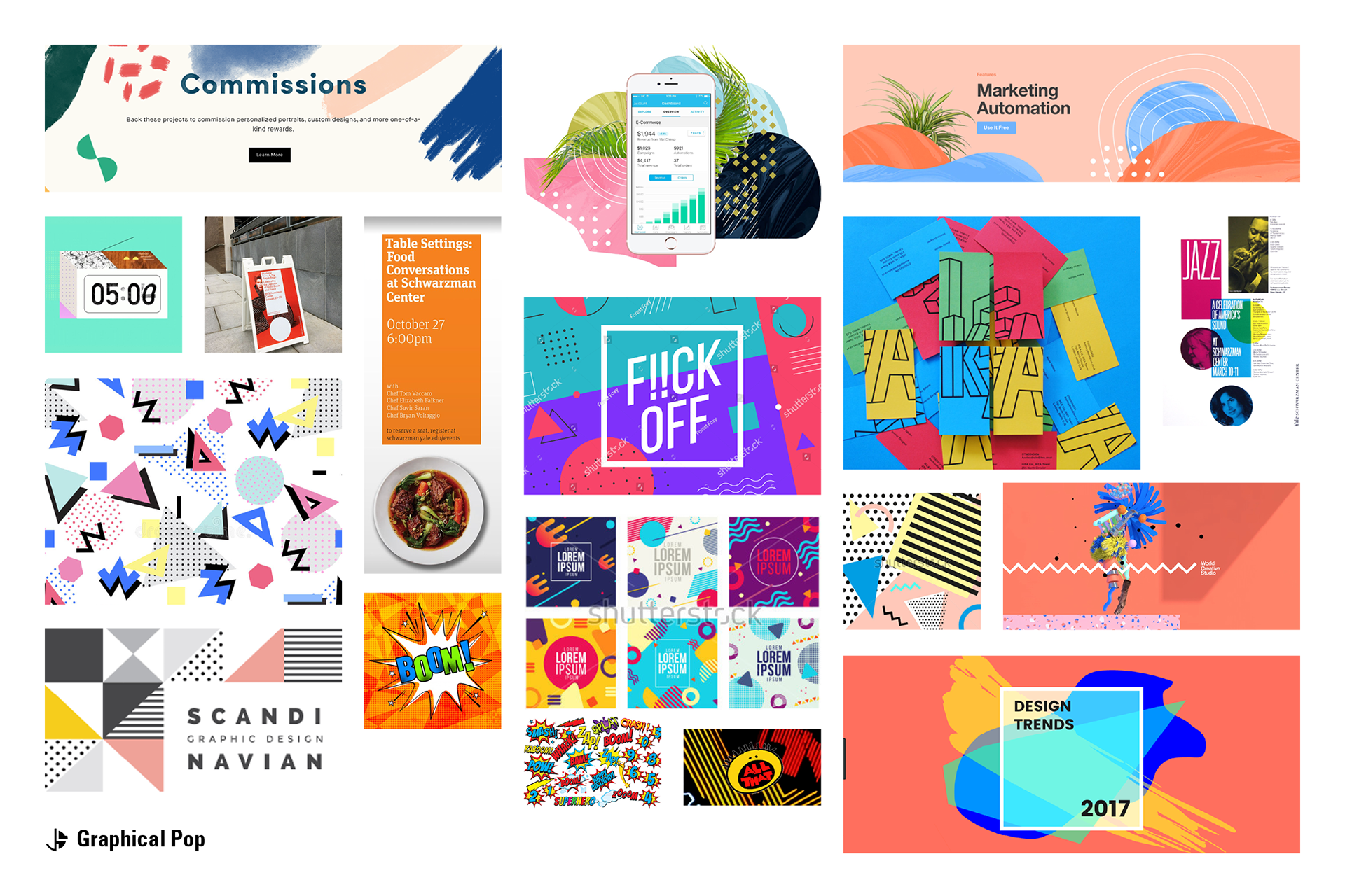
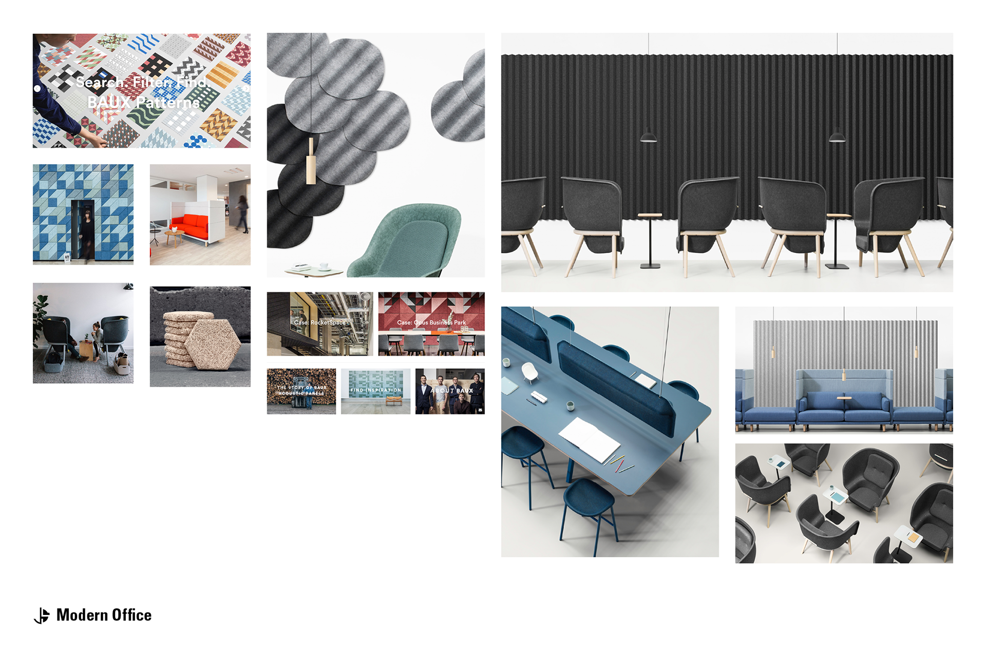
Below are the mood boards I created with visual inspiration that guided the brand and logo exploration.
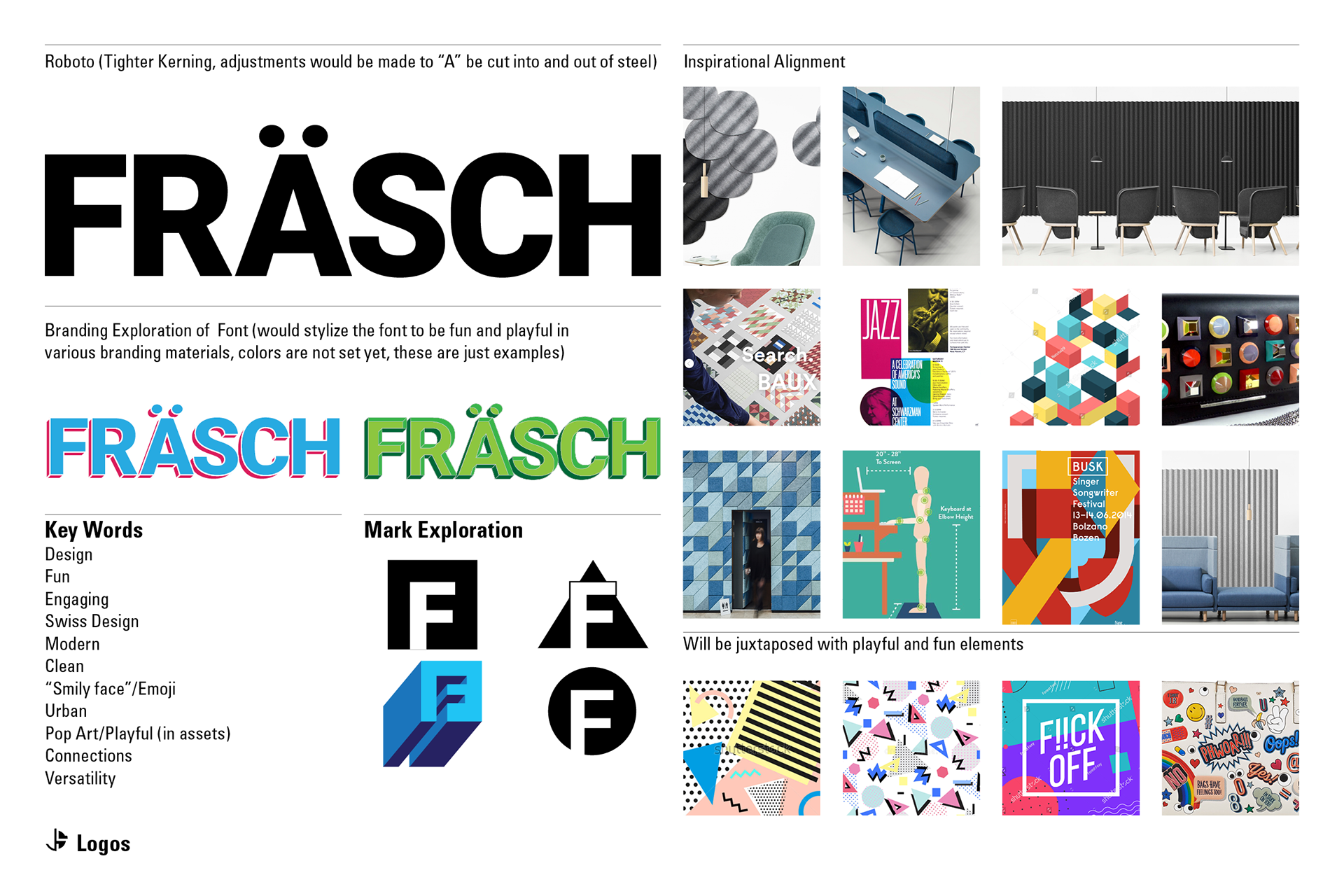
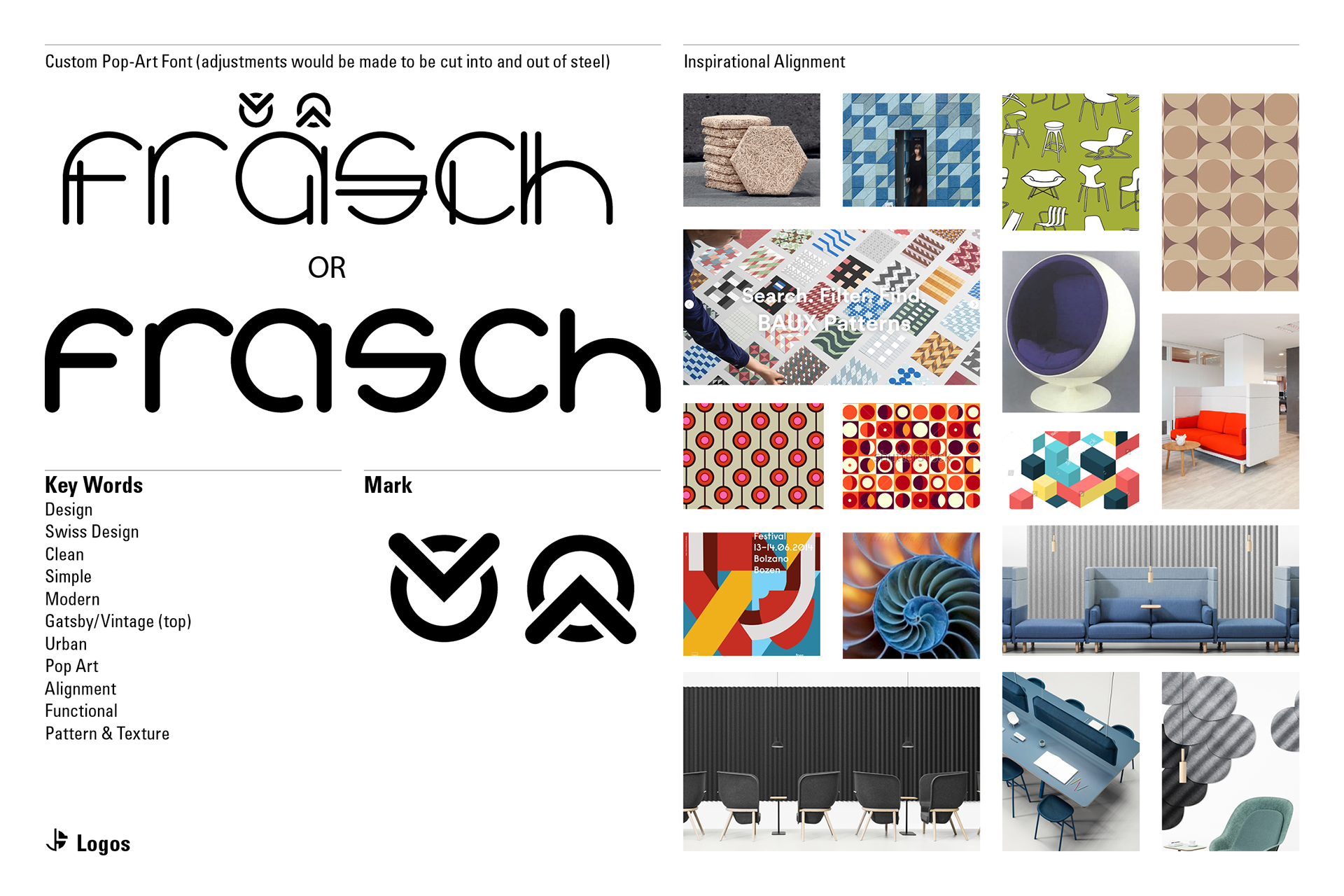
During the logo exploration phase, I presented 4 starkly different directions for the clients to choose from. Below are those presented concepts.
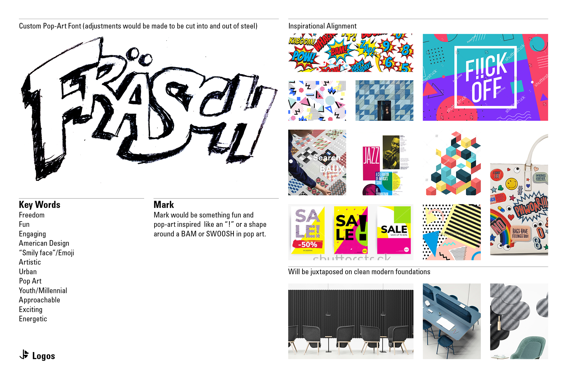
The winner was: Custom Playful Font (Below)
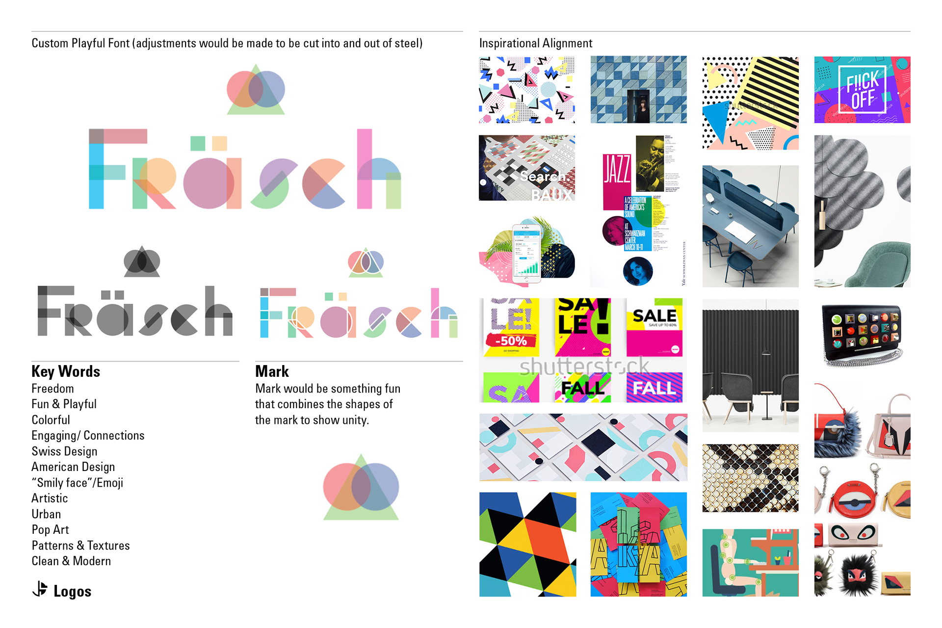
The client liked the visual concept but desired a font with greater correlation to Scandinavian design sensibilities. I took a deep dive into the type evolved from there.
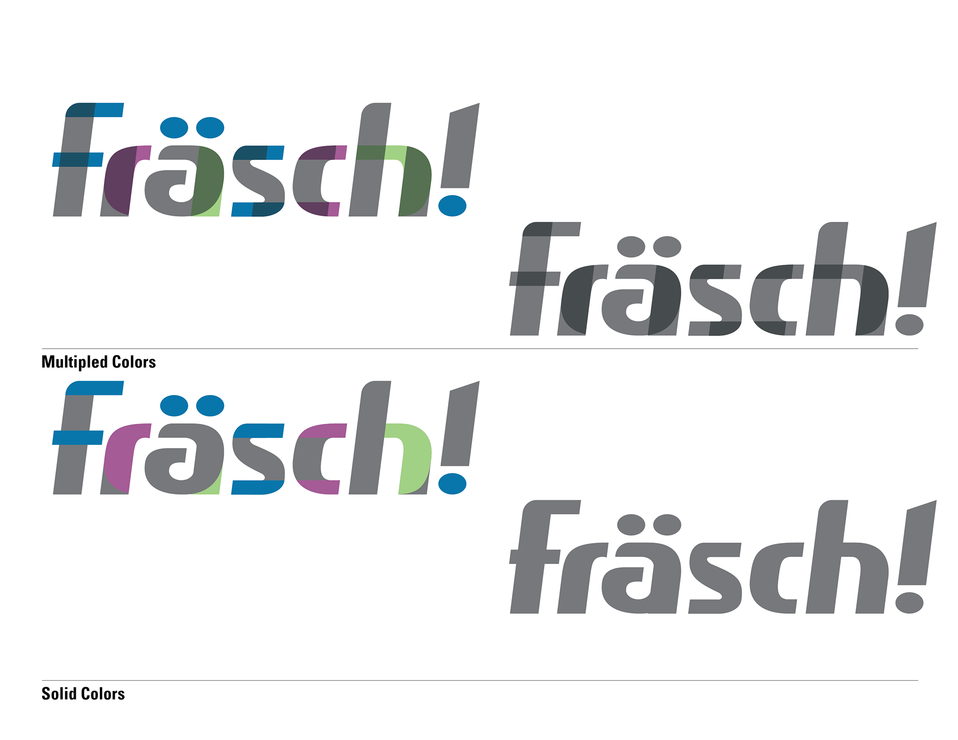
Being inspired by Storm Sans, I constructed a font that fit their vision by deconstructing the letter forms and emphasizing the connections with each letter. I added "!" to pay tribute the pop art & culture of American design. This allowed a very modern logo to have a playful undertone. The italics reinforce the idea of excitement and progress forward.
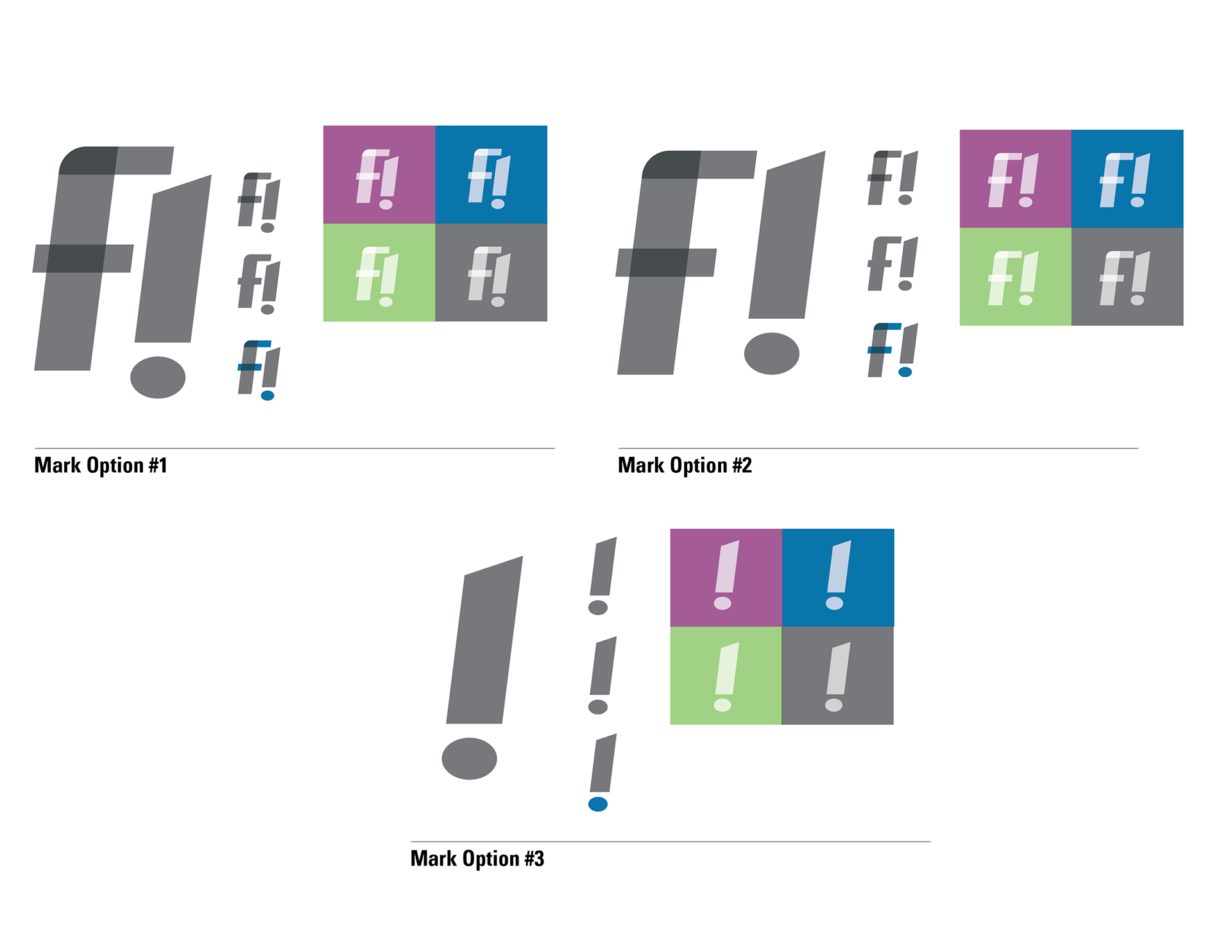
The "!" also lended itself as an exciting mark element that's easily recognized and has broad usability for the brand.
Brand Colors
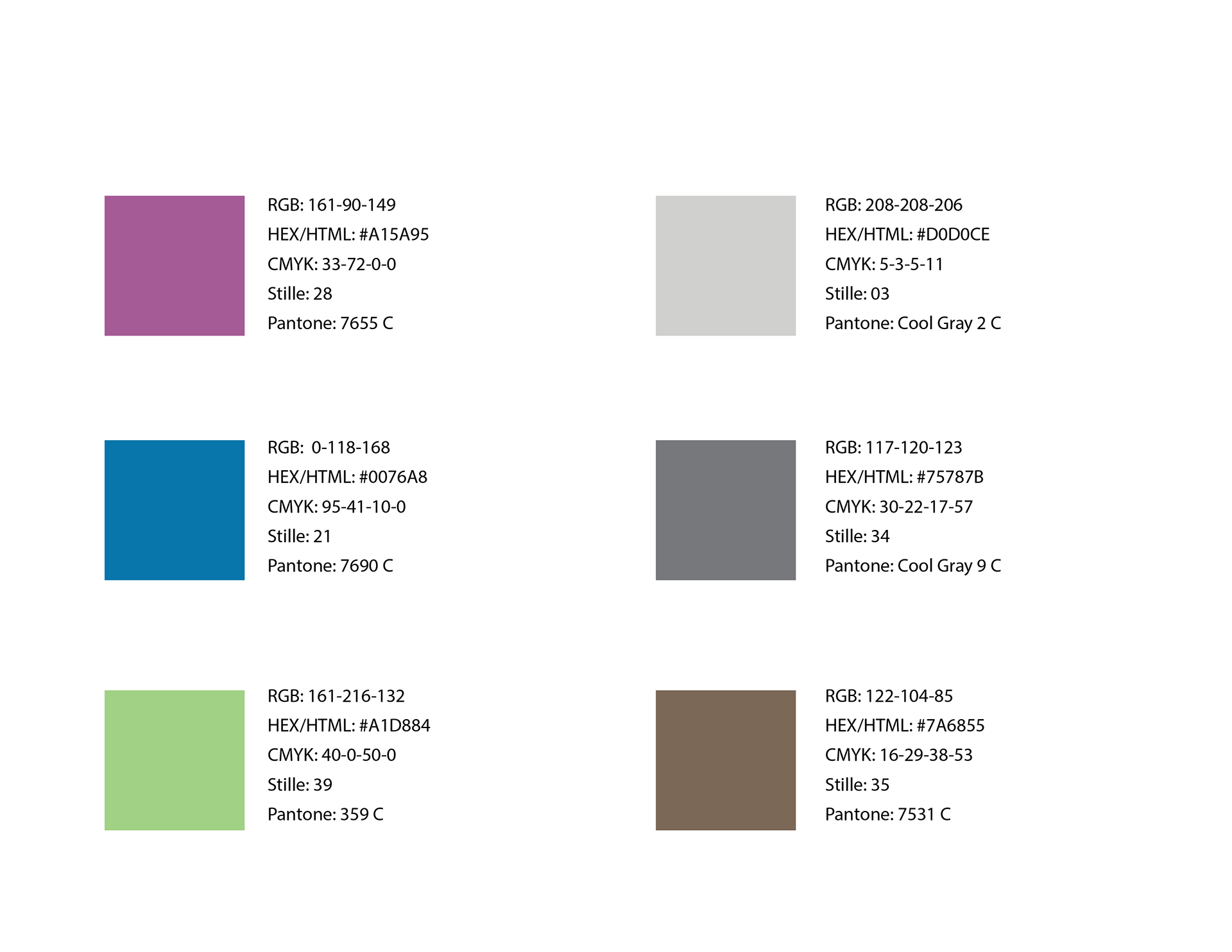
I selected a simple nature-inspired color palette to communicate the "wellness" side of the brand.
Purple = Stability Meets Energy / Power / Ambition
Blue = Water / Trust / Intuition / Stability / Imagination
Green = Plants / Wellness / Growth / Harmony
Cool Neutrals(s) = Sophisticated / Balance / Rocks
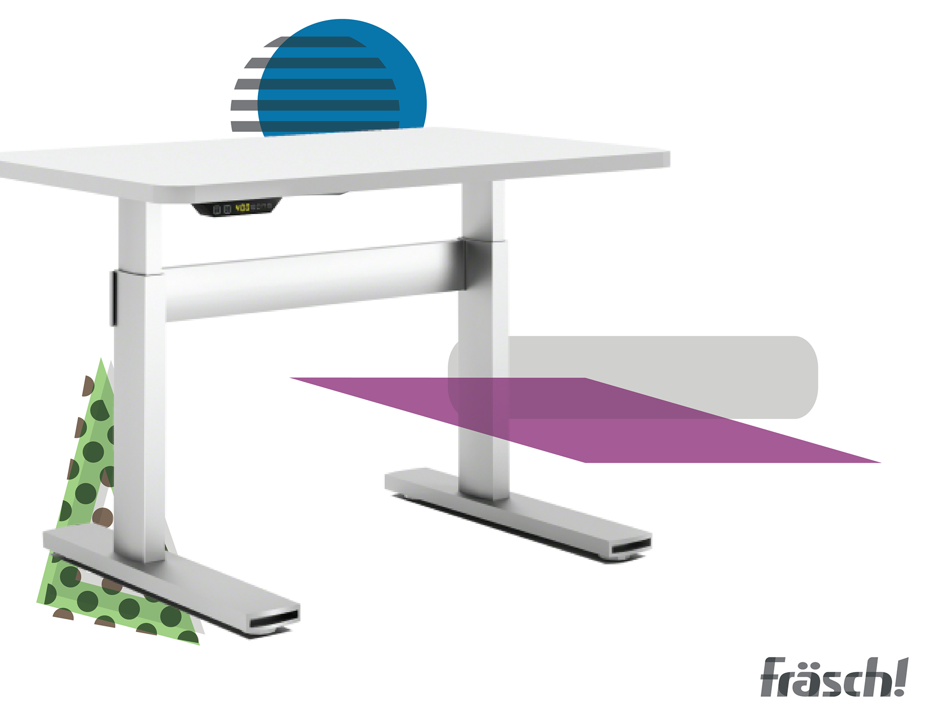
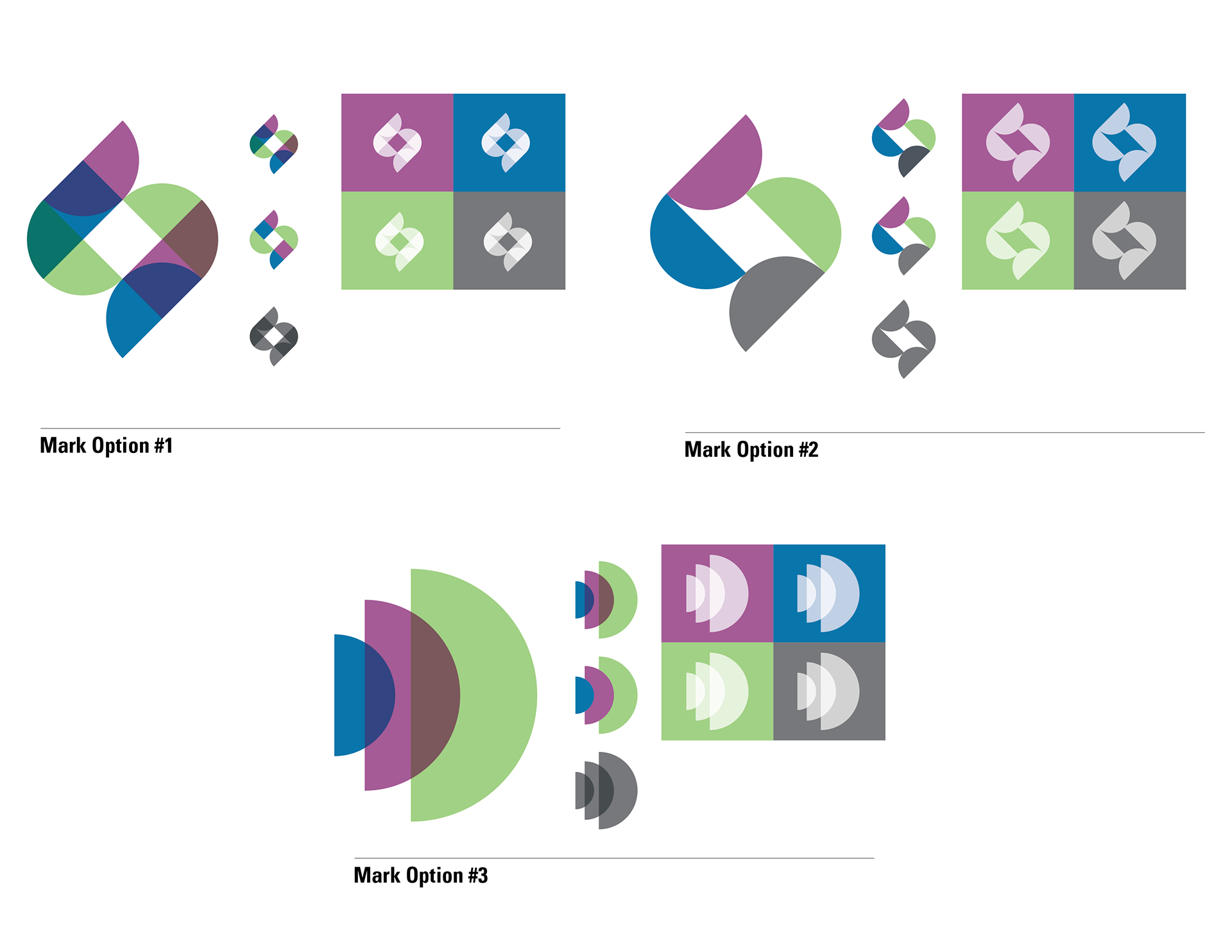
Branded Product Line
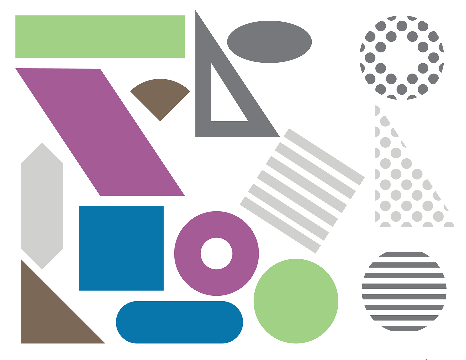
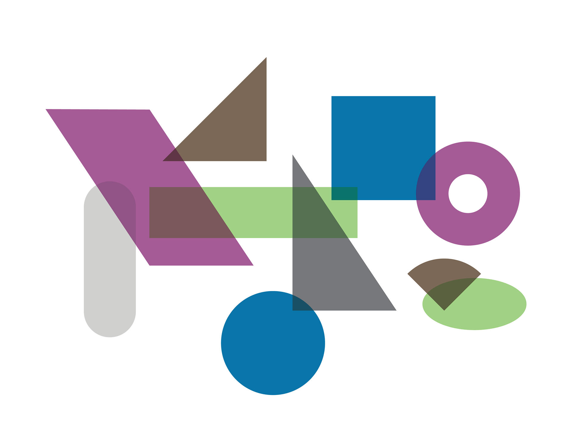
Branding Assets
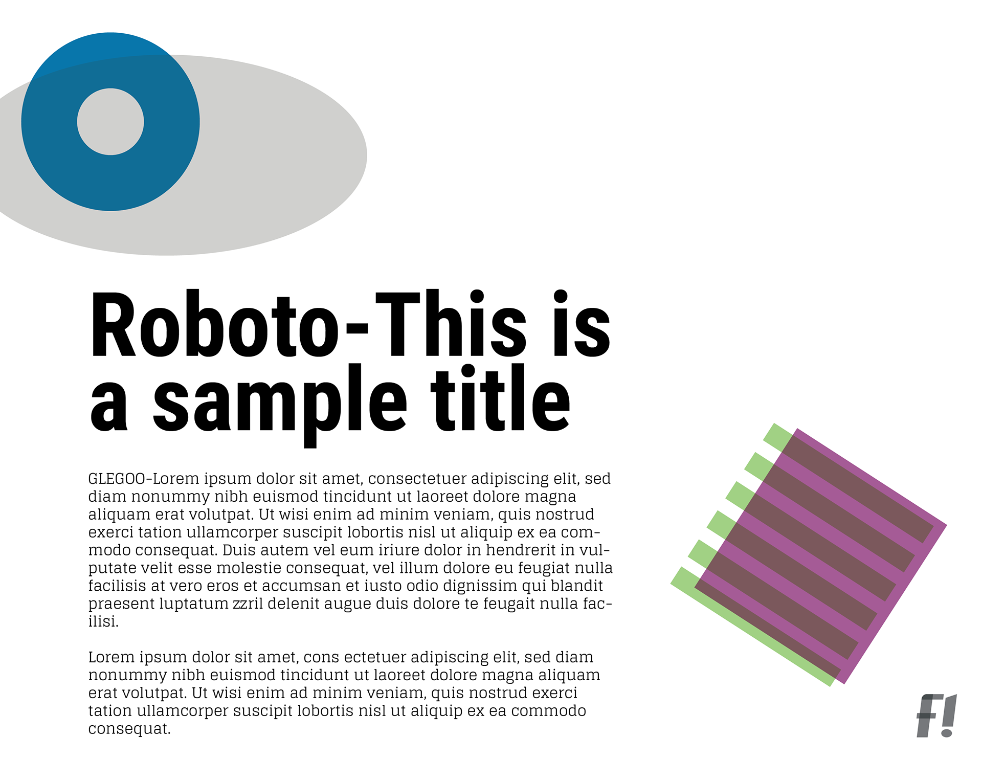
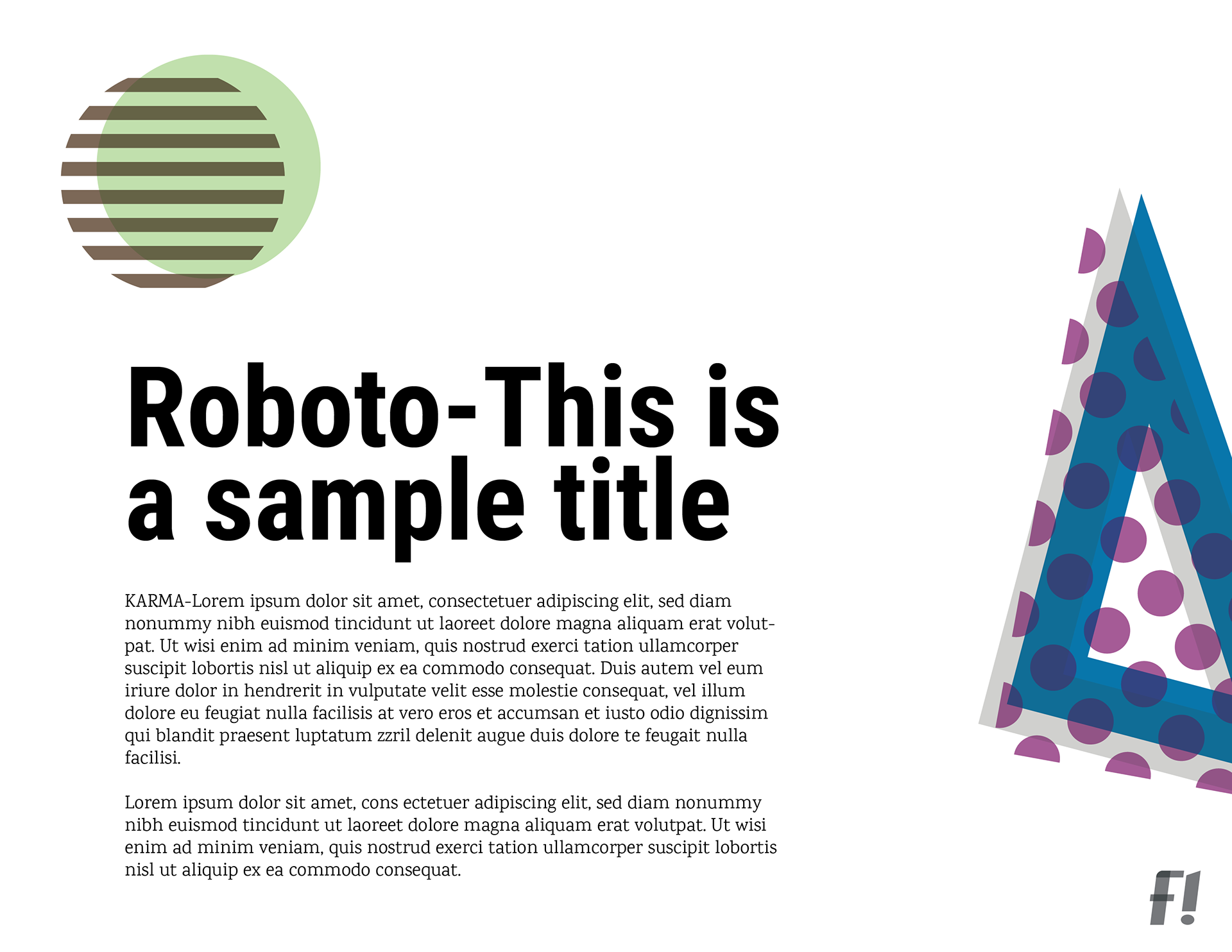
I carried the concept of connection by using overlapping in all brand elements. All assets are multiplied over one another. This allows colors to blend in unique ways while maintaining their visual independence and vibrance.
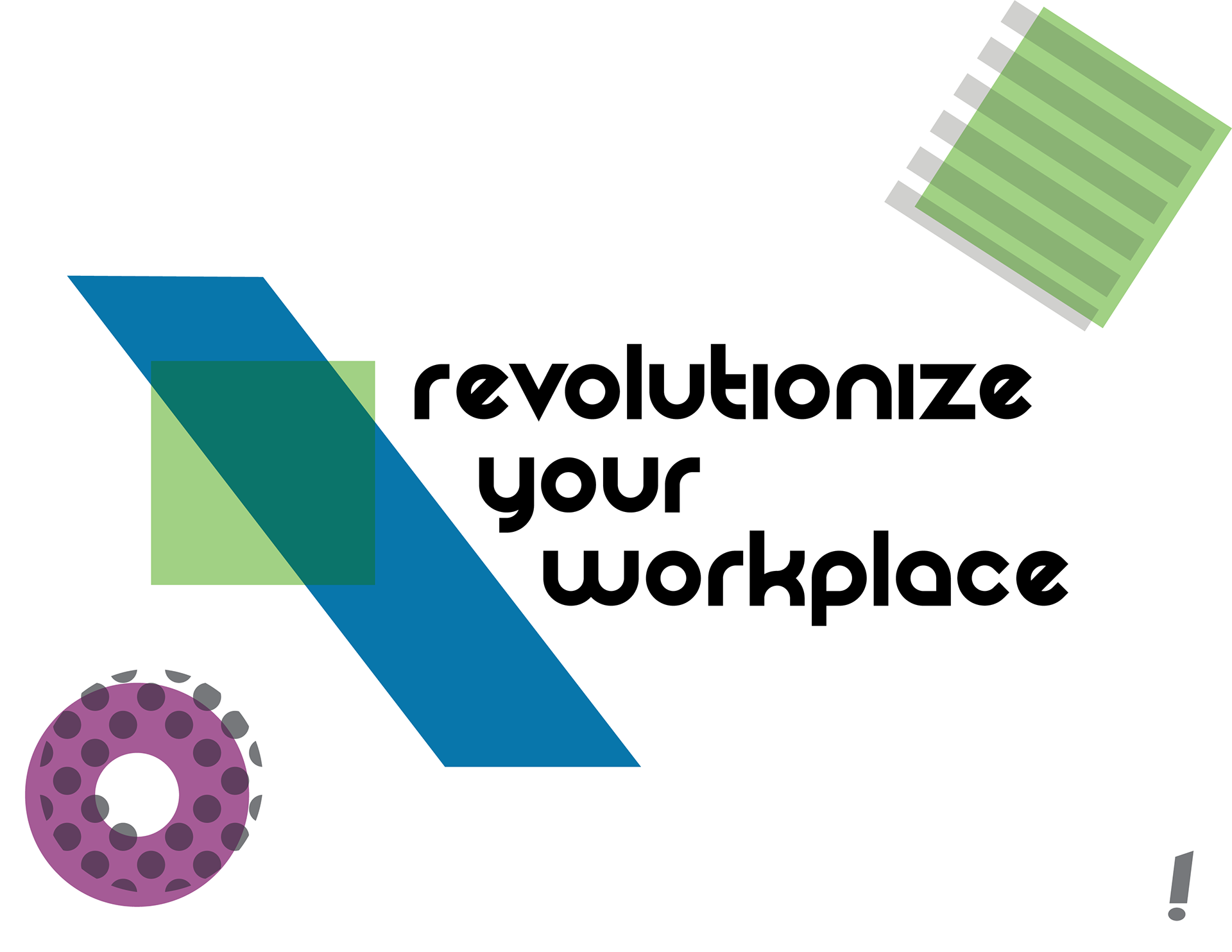
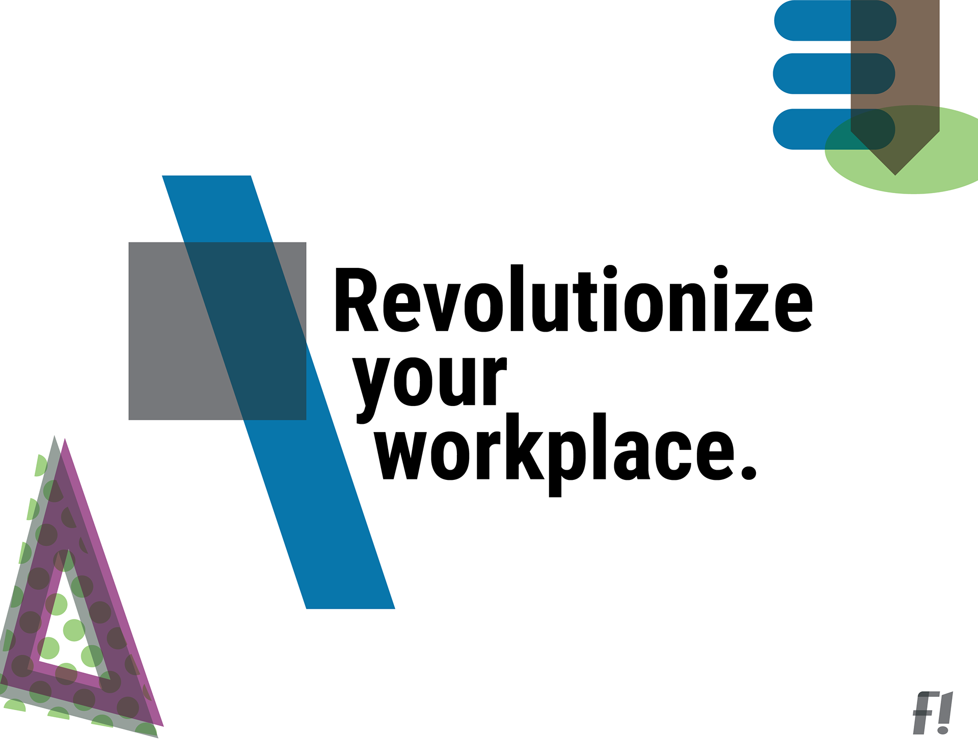
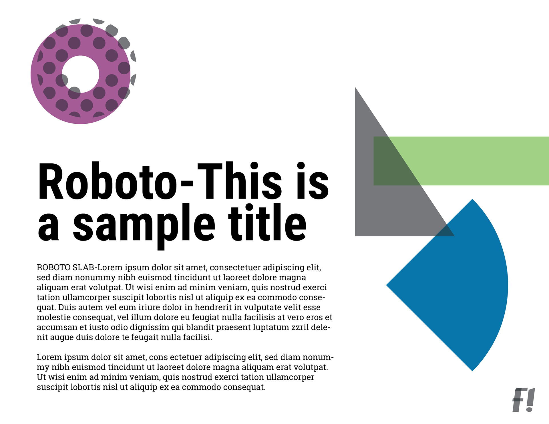
Branded Applications & Font Pairings
Below are a few visual examples of how the brand comes together with type and imagery.
The interaction between the elements is a tribute to American pop art and the playfulness of the brand. Intentionally placing the elements is what keeps these elemental interjections from becoming overwhelming & crowded.